Type in Brand Identity Today
Fragmentation, revival, and creative autonomy — Beyond trends
TYPOGRAPHY AS A FUTURE LANGUAGE
I believe we’re past the era of dominant trends.
In the years ahead, we won’t be able to speak of *a* typography trend,
but of many parallel vocabularies—each rooted in its own culture, rhythm, logic.
The question for brands is no longer “What’s in?”
but “What fits the way we think, move, and speak?”
“Deconstruction is not a style but a mode of questioning the technologies, formal devices, social institutions, and metaphors of representation.” — Ellen Lupton, Deconstruction and Graphic Design: History Meets Theory (2004)
BEYOND TYPEFACE PAIRING
I don’t think brands can survive with two or three typefaces anymore.
That model belongs to a time of static messaging and rigid manuals.
What I see coming is this:
Typographic systems made of 10, 12, 15 fonts—each with a role.
One to guide. One to interrupt. One to whisper. One to provoke.
Used not all at once, but across layers, moments, expressions.
This isn’t chaos.
It’s orchestration.
RECLAIMING THE ARCHIVE
The next wave of typographic expression will come
not from novelty, but from intelligent reuse.
The 1930s still hold untapped power—Bauhaus rationality,
elementary and functional typography, clarity without coldness.
And the 1990s will return in deeper ways: instinctive, messy, subversive.
We’ll see echoes of *Neville Brody OBE RDI*’s experimental fragmentation,
*David Carson*’s anti-grid dissonance,
*Ray Gun*’s visual disruption,
and the spirit of *Émigré*—where typography became discourse.
Not nostalgia, but a reminder: design can argue, not just decorate.
Even *COMME des GARÇONS*’ typographic method—
where type behaves like interference—will return.
Not as a reference, but as a practice.
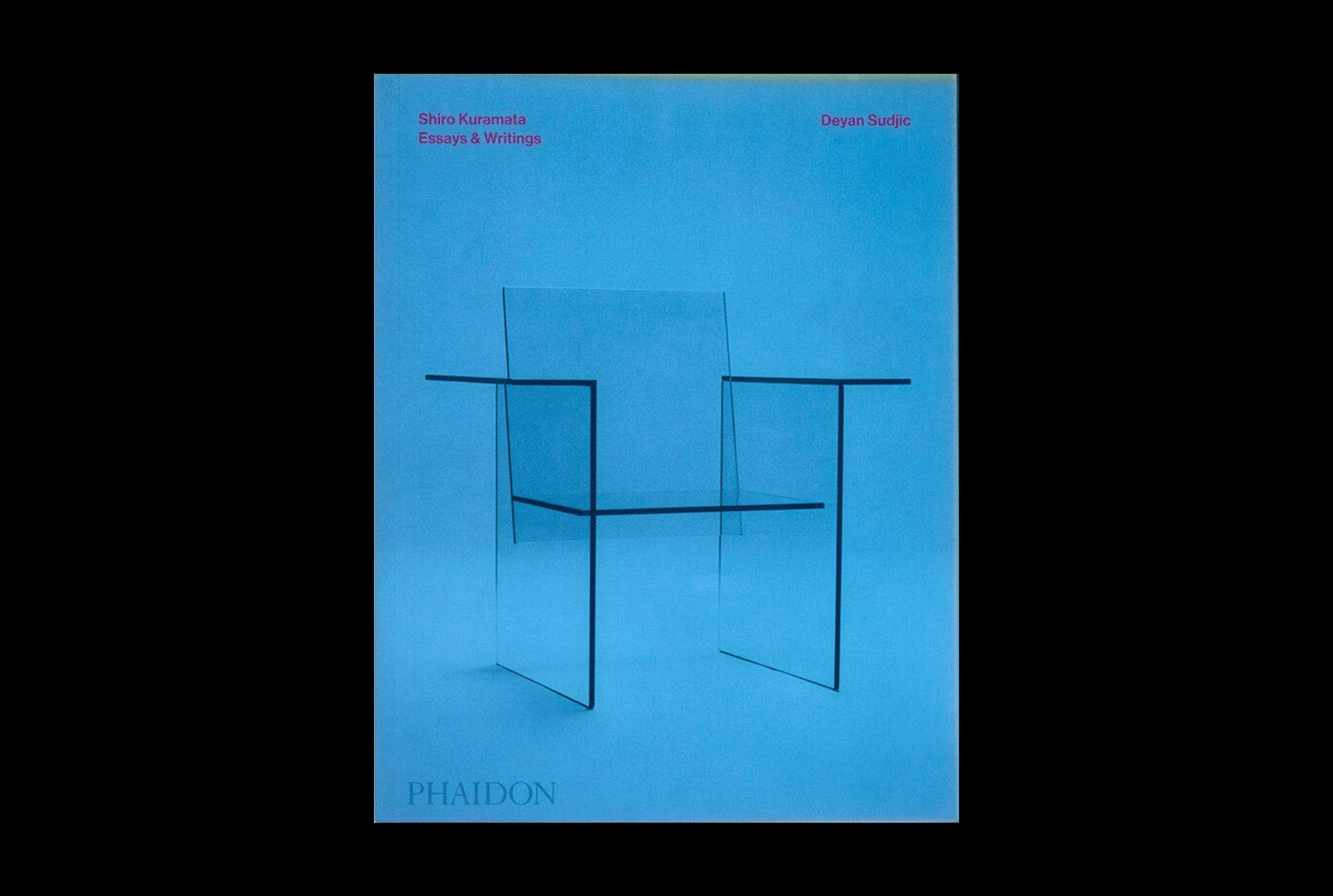
IMAGE AND TEXT
We need to move past the binary of typography
as either functional or decorative.
Text can be read.
It can also be seen, felt, misread, ignored, or sensed.
Some brands will use type as signal.
Others will use it as matter.
The page, the screen, the product—these become spaces of texture,
not just communication.
“Typography reveals how visual form intrudes into verbal content, transforming the supposed interior of meaning.” — Ellen Lupton, Deconstruction and Graphic Design: History Meets Theory (2004)
THE QUIET STRENGTH OF STRUCTURE
At the same time, structure will come back—
not as control, but as responsibility.
*Bauhaus*, *Swiss Style*, *Müller-Brockmann*:
not as visual style, but as ethical stance.
A belief that clarity is not neutral, but generous.
In a world of overstimulation,
silence and space will speak.
WHAT MATTERS NOW
Typography is becoming less about recognition, more about resonance.
It’s no longer what you use, but how it moves—how it adapts, listens, resists.
The most compelling brands of tomorrow
will treat typography not as a label, but as a living system—
able to stretch, contradict, disappear, reappear.
We’re not designing identities.
We’re designing behaviors.
█
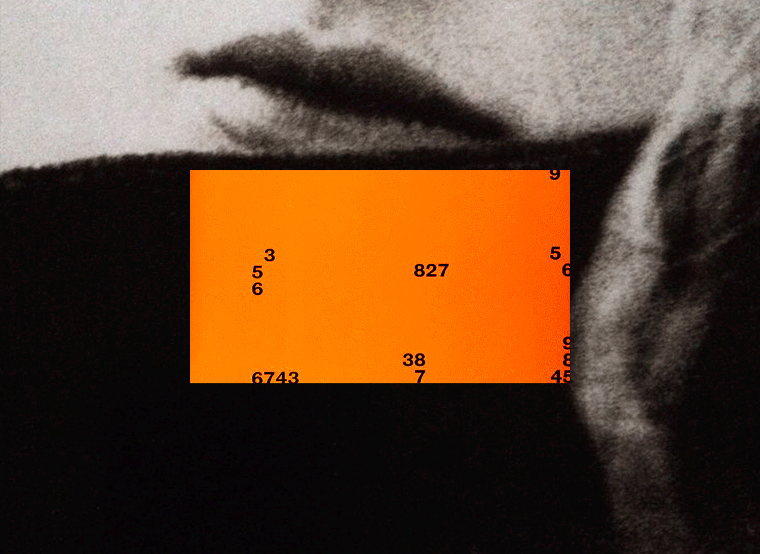
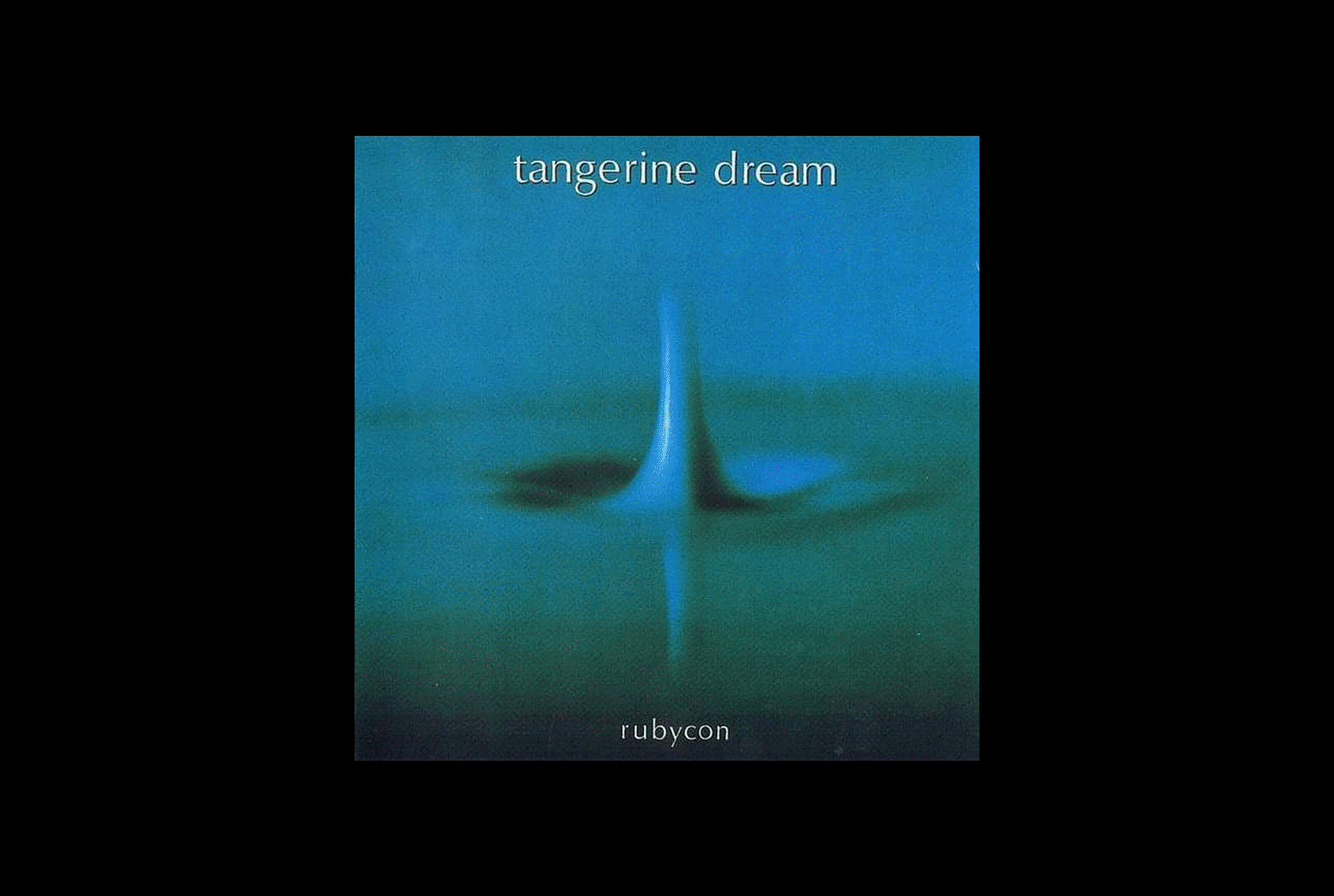
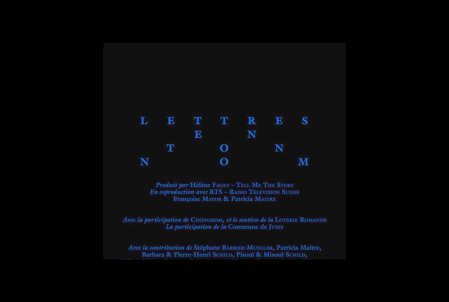
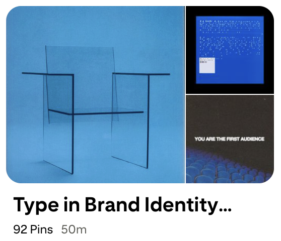
For those who want to look further, I’ve gathered a small visual archive that hints at the vocabularies quietly forming beneath the surface. Not trends, but trajectories ⸻ ↓ ⸻
█
Read all of Kandalaft's Articles on his Substack

Marc Kandalaft


